
Magazine Layout Design
Layout Project - John Pawson
Magazine Layout
It starts with an idea: This promotional campaign developed around the idea of the blue note, the note that in jazz and blues for expressive purposes is sung or played at a slightly different pitch from standard. The design strives to be different from standard, with color accents, and a retro feel to it. It took inspiration from Blue Note Record covers and its 1950's and 1960's designs by Reid Miles.
First the festival poster was created, then the logo, supporting graphics and patterns. Application shown on festival tickets and wristbands, social media channels and merchandise.
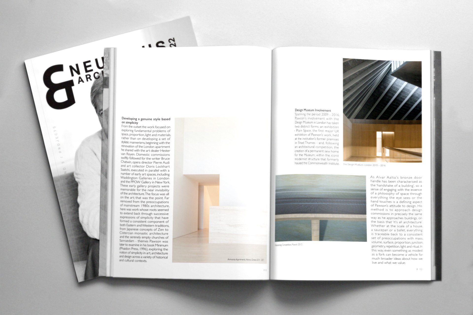
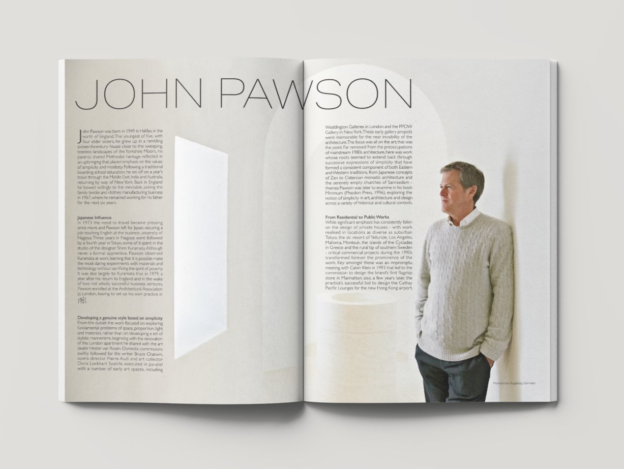
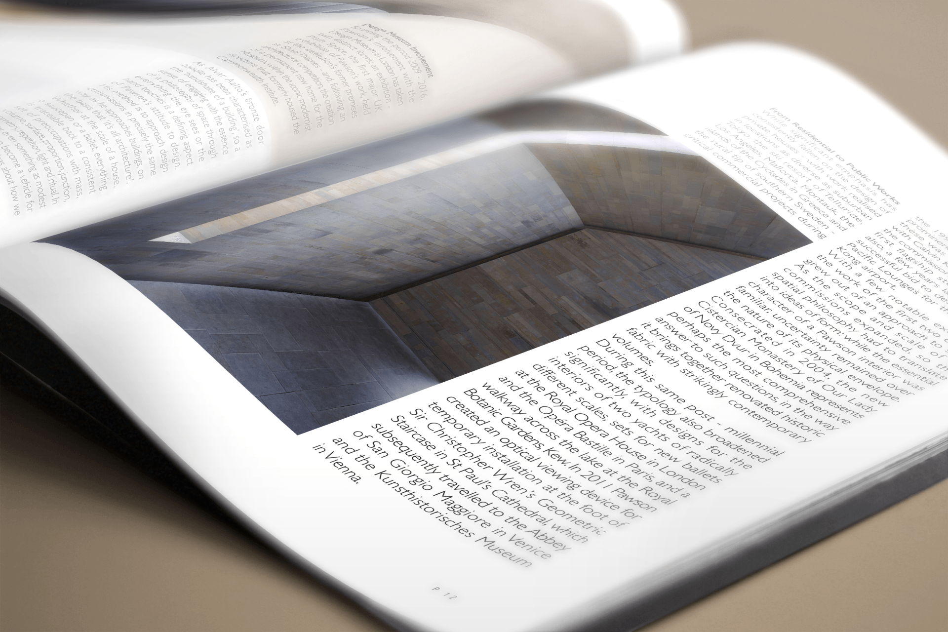
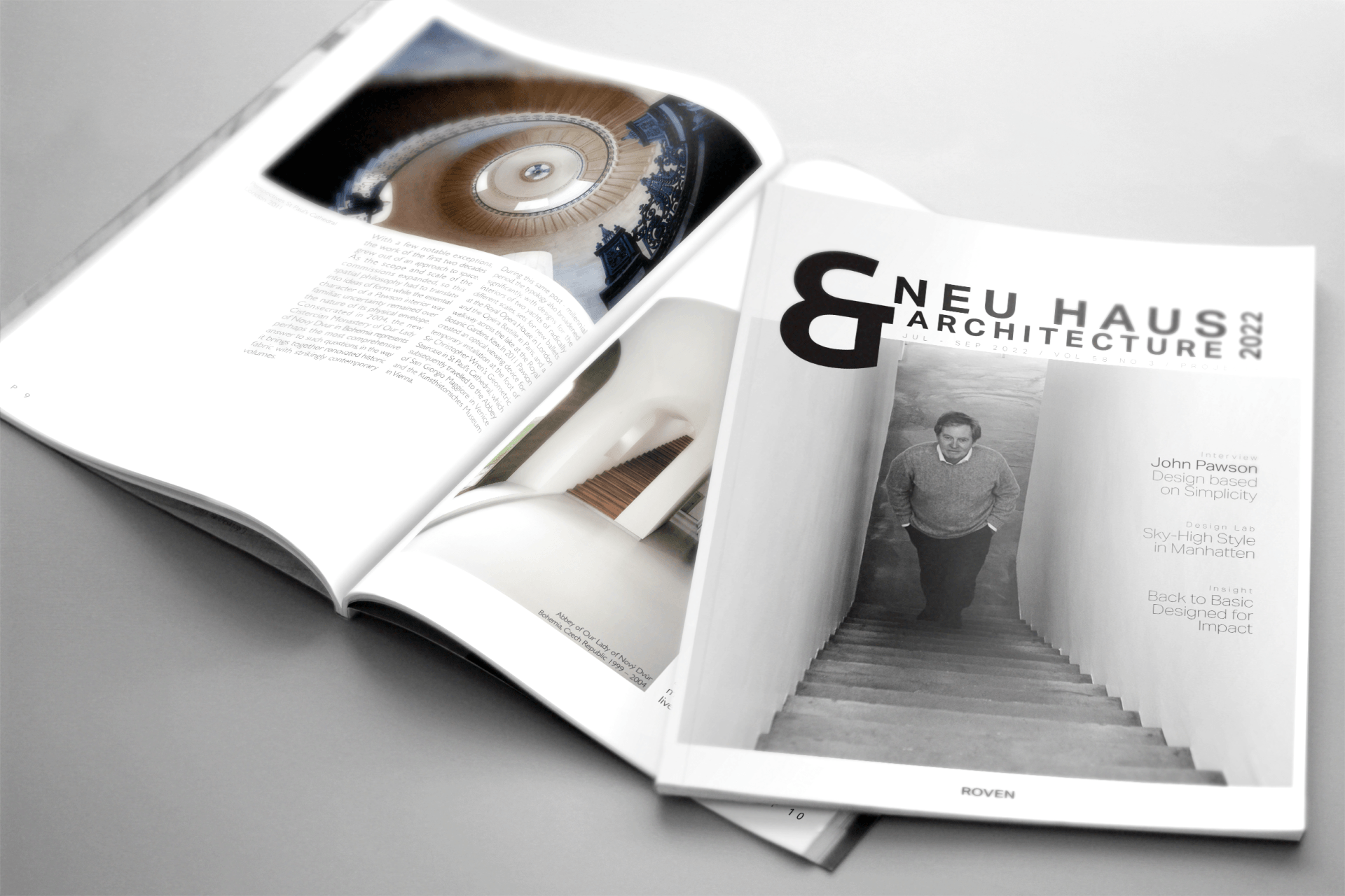
Layout Project
Cover Design / Page Layout: Opening Spreads
